With time, Kibana is becoming a very complete tool. But if Elasticsearch has always been very effective for geographic queries, the Kibana Map was still very limited.
Luckily with the last versions, the map visualization has been enhanced a lot!
Following our geo-located dashboard on the Covid19, let’s focus on how to use the map.
In this particular use case, we want to see the progression of Real Estate prices in France, to validate our future investments.
TL:DR
Kibana map is capable of :
- Handling multiple layers and indices.
- Managing GeoJSON files.
- Be Embedded on Dashboards.
- Ploting individual documents or use aggregations to plot any data set, no matter how large.
- Using data driven styling to symbolize features from property values.
Data
Thanks to the French Government, it was quite straight forward to have access to data, so I use official data of French cadastre : https://cadastre.data.gouv.fr/data/etalab-dvf
We’ll need to modify some details with an ingest pipeline, and in one small hour of work, we have a working index with 1 016 031 geo-located documents for the first 6 months of 2019.
The Map
We will create a map visualization.
The map tab still exists but we will not use it as the visualization has now the same capabilities.
Every data will be added as a layer, meaning you can easily mix several indices, with several layers. You can let the user choose if he wants to show it or not. (A layer for real estate, a layer for schools, a layer for Underground stations, etc…)
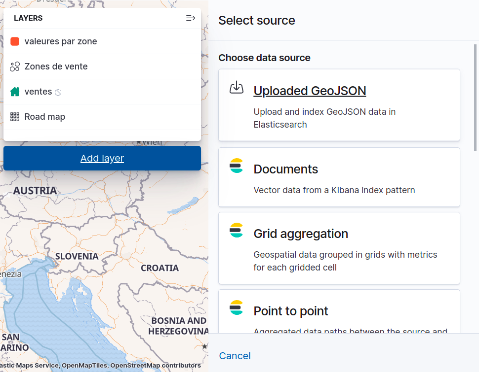
And we now can easily add value by uploading directly a geo-json file.
As other possibilities, you can of course use indices, and you benefit from building in tiles from Elasticsearch, with common countries boundaries, road maps etc….
Let’s add our first layer.
Sold layer
We choose our brand new index, and want to show all the sold properties on the map.
We wil just limit the minimum zoom visibility, because it makes no sense to show a home icon when we are at the world level.
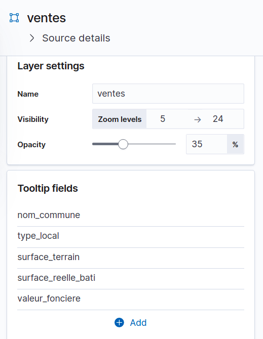
We choose valuable data for the tool tip, the city, the type of property, the field size and the selling price.
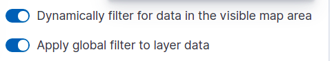
We will also check the two filter values to make the graph works as it should in our future Kibana Dashboard.
And the result for my home town is :
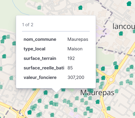
Pretty Easy!
Zone with most exchanges
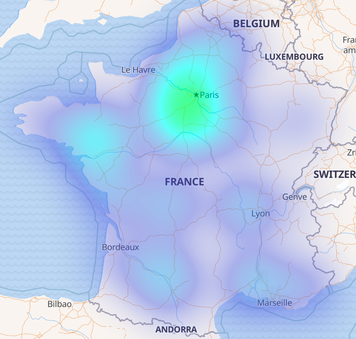
On our second layer we want to show how hot is the demand.
So we will add a heat map with the count of exchange and move it under other ones.
It’s not a surprise to see that Paris is hot but what a surprise to see that Bretagne is also a hot zone. It could be a good idea to focus on this area.
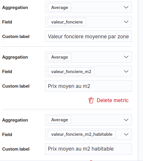
Aggregated Prices by area
Maybe the most interesting layer.
We want to know the average selling price for a region.
Let’s add a “Grid aggregation Layer” on the same index with some averages :
- Average values
- Average value by square meter
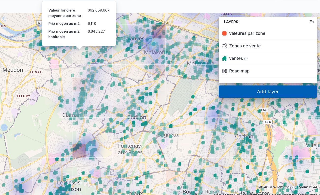
With no transparency, we would have the following layer.
Not that tiles size will automatically be adapted with the map zooming level.
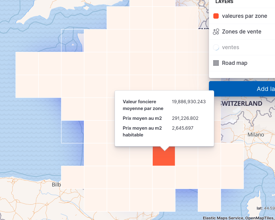
Let’s move it just below the heat map.
Now we have functional map.
We are now able, in one sight, to know where it’s worst to invest in France, depending of the type of property and have a good Idea of the good cost of it, region by region.
I love that.
Now let’s add few other metrics in a dashboard to give easily readable information.
Kibana Geo Dashboard
It’s pretty easy to create a new dashboard and to add our map, we will not detail it in this post.
We will add some metrics:
- Max, average and min prices
- The percentiles selling prices (with the median price)
- And the pricing evolution
As the user is the key to success, let’s give him more power with controls visualization.
And has in Kibana, everything in the dashboard reacts to the general filters, it’s really easy to have all this data for a city, a geo-zone or a time range.
In the following small video, you’ll see all the power of the map :
A pretty interesting result for half a day of work isn’t it?